 Denzil Otieno
Why Your Landing Page Doesn’t Convert: The Narrative Users Actually Look For
Landing pages fail for two reasons: mechanical friction (slow load, weak CTA, long forms) and a story that doesn't match the visitor's. Both, with fixes.

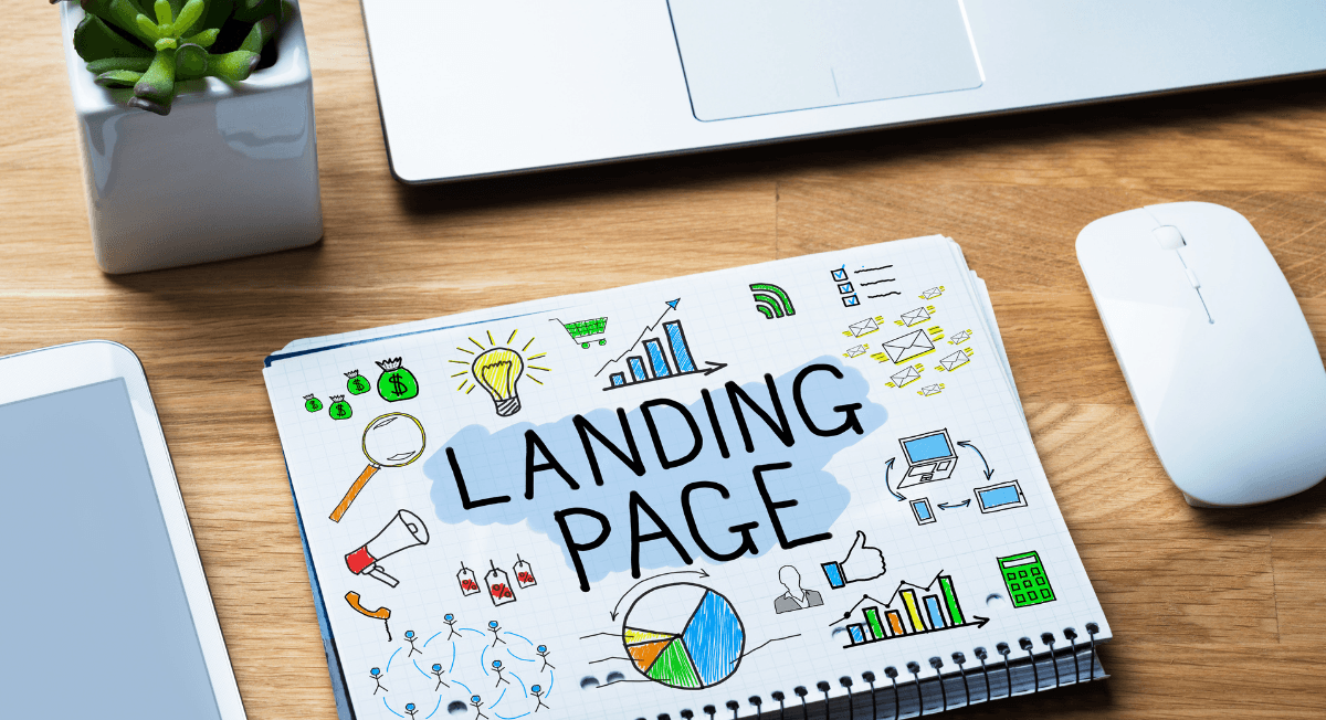
A landing page that does not convert is failing in one of two places: the mechanics (slow load, competing links, long forms, a vague CTA) or the story, where the page never mirrors the problem the visitor arrived carrying. The mechanics take an afternoon to fix, and every guide on this question covers them. The story is the reason pages that pass every checklist still leak money, and almost nobody covers it.
Key takeaways:
- Fix message match first: the page's opening screen must continue the exact thought that made someone click the ad or result.
- Strip the page to one action. Navigation, footers, and competing CTAs are conversion leaks; removing navigation alone doubled conversions in VWO's Yuppiechef test.
- Ask only for what the offer is worth: every extra form field costs a percentage of completions.
- Averages sit around 2–5% conversion; top pages hit 10%+ because they open with the visitor's problem, not the product's features.
- Proof works only where doubt happens: put specific testimonials next to the CTA, not in a logo row nobody reads.
The average landing page converts somewhere between 2% and 5% of its visitors, and the best clear 10%. The distance between those numbers is rarely design; it is recognition: whether the visitor finds the story they were searching for on your page, or scrolls once, pauses, and leaves with the ad spend that brought them.
Visitors arrive with a quiet question in their mind, and it is rarely the one the page tries to answer. They want to understand the tension your product resolves before they care how it works: the friction they keep running into, the pattern they cannot fully name.
Most landing pages start at the surface instead, leading with features, UI shots, and claims that connect to nothing the visitor already feels. When the story fails to match the struggle, users disconnect instantly, and they do not come back.
This is why even beautiful landing pages underperform: they describe the product but never reveal the narrative that gives it meaning, and until that narrative is clear, conversion will always feel unpredictable.
10 Common Reasons Landing Pages Don't Convert (and the Fix for Each)
Clear the mechanical failures first, because each one is measurable, each has a direct fix, and together they decide whether the narrative work later in this article ever gets a chance to matter. The full set at a glance:
| # | Reason | The fix |
|---|---|---|
| 1 | Message doesn't match the ad | Mirror the ad's promise in the headline |
| 2 | The page behaves like a homepage | Remove nav and secondary links; one action |
| 3 | No orientation in the first 5 seconds | Headline names the visitor's situation |
| 4 | Too much text, nothing scannable | Short blocks, subheads, one idea per section |
| 5 | Form asks too much too soon | Cut to essential fields; split into steps |
| 6 | No trust where doubt happens | Specific proof next to the CTA |
| 7 | Slow load, weak mobile | Compress, cut scripts, test on a real phone |
| 8 | Generic CTA | Describe the outcome, not the action |
| 9 | No reason to act now | Honest urgency tied to the offer |
| 10 | Weak offer | Raise the value before touching the copy |
1. The message doesn't match what brought them. A visitor clicks an ad about one specific promise and lands on a page speaking in generalities; the disconnect reads as "wrong place," they are gone before the second screen, and the click gets billed either way. The fix: every traffic source gets a first screen that continues its exact message, down to repeating the phrase that earned the click.
2. The page is really a homepage. Navigation menus, footer links, and multiple CTAs give visitors a dozen exits from the one path that converts. In VWO's Yuppiechef A/B test, removing the navigation menu alone doubled the landing page's conversion rate from 3% to 6%. The fix: a dedicated page with a single action and no escape routes. The two page types are doing different jobs:
| Homepage | Dedicated landing page | |
|---|---|---|
| Job | Orient many audiences | Convert one audience |
| Links | Full navigation, footer, blog | One CTA, repeated |
| Message | Broad brand promise | The ad's exact promise |
| Traffic | Every source | One campaign or intent |
| Success metric | Engagement | Conversion rate |
3. Nothing orients the visitor in the first seconds. People decide whether they are in the right place before they read anything carefully, and Nielsen Norman Group's research found that 79% of users scan rather than read. The fix: a headline that names the visitor's situation, not your product category, so the scan finds a match instantly.
4. There is too much text and nothing to hold onto. Dense paragraphs force visitors to work for the point, and scanning eyes slide straight past them. The fix: short blocks, descriptive subheads, and one idea per section, so a scanner can reconstruct the whole argument from the bolded phrases and headings alone.
5. The form asks for more than the offer is worth. Name, phone, company size, budget: each field is a toll, and visitors quietly weigh the toll against what they are getting. The fix: ask for the minimum the next step truly requires. If sales needs more, use a multi-step form and collect it after commitment has started.
6. Trust is missing at the moment of doubt. Logo rows at the bottom of the page do nothing, because doubt happens next to the button, long before anyone scrolls that far. The fix: one specific, attributable testimonial or result placed beside the CTA, mirroring the exact situation your visitor is in.
7. The page is slow or breaks on mobile. Portent's site-speed research found that a page loading in 1 second converts 2.5x better than one loading in 5 seconds (3.05% vs 1.08%), and most first visits now happen on phones where heavy pages fall apart. The fix: compress images, cut third-party scripts, and walk through the page on a real device, not a resized desktop browser window.
8. The CTA describes labor, not outcome. "Submit" asks for effort; "Get my teardown" promises value. HubSpot's analysis of 330,000 CTAs found personalized CTAs convert 202% better than generic ones. The fix: rewrite the button as the thing the visitor receives, and match it to who they are. The pattern is easy to apply:
| Weak CTA | Stronger CTA | Why it works |
|---|---|---|
| Submit | Get my free teardown | Names what arrives |
| Learn more | See how it works in 2 minutes | Sets cost and payoff |
| Sign up | Start shipping on time | Promises the outcome |
| Contact us | Book a 15-min strategy call | Specific, low commitment |
| Download | Send me the checklist | First person, concrete |
9. Nothing happens if they wait. A visitor who leaves "to think about it" almost never comes back, and a page that gives no reason to act now invites exactly that. The fix: honest urgency tied to the offer itself, like a cohort start date, a limited bonus, or capacity limits. Fake countdown timers erode the trust the rest of the page built.
10. The offer itself is weak. No amount of optimization converts an offer nobody wants. Teams check this last because it is the hardest one to hear. The fix: strengthen the deal before rewriting another headline. Look at trial length, guarantee, bonus, price framing, or the promise itself.
Those ten fixes are necessary, and on most pages they are worth real percentage points. But if you have made them all and conversion still disappoints, the problem is the layer underneath: the story, and the story is where the rest of this article lives.
What Users Expect Before They Read a Single Word
The Silent Question Driving Every Landing Page Visit
Before users read your headline or interpret your benefits, they are asking themselves a quiet question: "Is this for me?" They never phrase it consciously; they simply feel it, and they feel it fast. They scan for immediate fit before they read for meaning, because a problem brought them here and your page is just the next stop in a story that already started.

What they want in those first seconds is recognition: a headline that reflects their situation, a phrase that sounds like the problem they typed into Google an hour ago, a sense that whoever built this product has watched them work. A page has to feel like it is about the visitor before any argument on it can land, which is why so much technically correct copy converts nothing.
When that first moment of recognition is missing, users simply leave, without reading further, without evaluating, and without ever "considering the offer," because nothing on the page tells them their story is understood. Recognition is a pass-fail test graded in seconds, and pages that fail it never get graded on anything else.
The Narrative Lens Users Bring With Them
Every user lands on your page already carrying a story, built from past tools they have tried, workflows that no longer scale, and a quiet expectation of what the solution should feel like. They arrive mid-chapter, and your page gets judged by how well it continues the chapter they are in.
So the moment they hit your page, they evaluate it through that ongoing narrative. They are scanning for continuity: whether the page extends the story they were already telling themselves about their problem and the kind of solution they believe should exist.
When that continuity is missing, everything stops, no matter how accurate the copy, how clean the layout, or how strong the offer. If the user cannot find where their story fits, the page feels irrelevant, and that gap between the user’s internal narrative and the page’s narrative kills more conversions than the headline, the design, or the CTA ever will.
The Real Reason Landing Pages Fail
The Message Is Usually Right But the Story Is Missing
Most founders already have accurate headlines, true benefits, and value propositions that make sense on paper. The trouble is that accuracy and narrative are different things, and users make their decisions inside the narrative.
What users see on most landing pages is a list of features and statements, all of them correct and all of them sitting still. Nothing in them shows the user what changes, what shifts, or what becomes possible once the product enters their world, and accuracy without direction is the same failure that undermines conversion copy: persuading at the moment the buyer needs clarity.

Pages end up telling features instead of moments, describing what the product does while never showing the turning point a user is hoping for. Without that turning point the page falls flat: it informs, but it does not move anyone to act.
And that is the real reason users walk away. They cannot imagine themselves moving from their current pain to the outcome the product promises, so they hold onto their current tool and their current frustration, no matter how well they understood your page. Understanding was never the bottleneck.
The Fold Breaks Under the Weight of Assumptions
Most founders assume users want to see the product immediately. They prioritize a clever headline, open with a promise they hope sounds strong, and place a polished screenshot front and center, believing the user needs to be impressed first.
But that is rarely what users look for in the first five seconds. What they are searching for is orientation: confirmation that they are in the right place and that the page understands the moment they walked in with. Beauty, technical depth, and benefits all matter later, once orientation is settled.
This is where the fold either carries the story or collapses it. When the first section answers the user’s silent question, the rest of the page gets a chance to work. When it leads with assumptions the user does not share, everything that follows becomes invisible.
The Narrative Users Actually Look For
The Hidden Structure Behind High-Converting Pages
Watch users move through a landing page and the sequence is remarkably consistent: they follow an emotional order long before a logical one, recognition first, relevance next, reasoning last.
Think about the last SaaS tool you evaluated quickly: you skimmed for whether the page understood why you came, interpreting the story rather than the structure, and only slowed down once something on the page felt like it was written for you.

This is why story order matters more than story length. A short page can convert well if the emotional beats land at the right time, and a long page can convert even better if the narrative pulls the user forward. But when the story introduces ideas out of order, the user starts working harder than they should.
That is where cognitive load rises, and the cause is almost always an unclear story rather than a complex page. When users cannot tell why a point appears where it does, reading starts to feel like work, and work is the moment they leave. High-converting pages are not magic; they are pages where the product story is easy to follow.
Users Look for Transformation, Not Tools
Visitors are wondering one thing when they land on your page: whether they will be better after using your product. How impressive the product is barely enters the equation. A project manager wants to feel less overwhelmed, a founder wants to feel more in control, and a marketer wants confidence they can hit targets.
That is the transformation they are scanning for, and it is why outcome lines hold attention so fast. A single line like “Ship projects on time without thinking about follow-ups” tells a project manager more than any feature list could, because it describes their Tuesday, fixed.
When you make that transformation visible early, everything else becomes easier to understand: the features turn into stepping stones, the benefits stop sounding generic, and the story becomes something they can follow without effort. What users need is a believable turning point, and a believable one beats a spectacular one every time.
Show the moment things shift, what improves, and how life looks after your product does its work. Once they can imagine themselves inside that transformation, the rest of the page finally has room to persuade.
What Counts as a Good Conversion Rate?
Landing page averages across industries sit roughly between 2% and 5%, with top-performing pages reaching 10% or more. The gap between average and top is rarely design polish. It is relevance: how precisely the page continues the visitor’s own story.
The tested numbers behind the fixes above are worth keeping in one place:
| What was tested | Result | Source |
|---|---|---|
| Removing navigation from a landing page | Conversions doubled, 3% → 6% | VWO / Yuppiechef |
| Personalized vs generic CTAs (330k CTAs) | +202% conversion | HubSpot |
| 1-second vs 5-second load time | 2.5x higher conversion rate | Portent |
| How users process page copy | 79% scan rather than read | Nielsen Norman Group |
Treat benchmarks as orientation, not targets. Your traffic source, offer strength, and price point move the number more than any industry table. The metric that matters is whether your own rate trends up as you apply the fixes above and the narrative work below.
The Missing Middle: Where Most SaaS Pages Lose the User
When Logic Shows Up Before Resonance
A landing page starts slipping the moment it explains too soon. Founders jump into features, workflows, and mechanics before the user feels understood. It feels natural from the inside, but users arrive with a different lens: they are trying to locate themselves in your story, not absorb technical logic. And value they cannot immediately see might as well not exist.
When explanation comes before resonance, the user feels distance instead of recognition. You have felt this yourself: when a page opens with what the product does instead of why it matters to you, attention drifts almost immediately.

This is the gap between describing and translating: describing tells the user what the product is, while translating shows them why it matters right now. A description reads like a product tour, but a translation reads like the user’s own thoughts, continued.
The difference is easiest to see side by side. Describing: “Our software uses smart automation to streamline workflows.” Translating: “If you juggle tasks across multiple tools and lose hours chasing updates, here is where that chaos finally stabilizes.” The first line informs; the second connects, and connection is what keeps people reading.
Proof Without Meaning
Landing pages often add social proof because it is expected. Logos, testimonials, and case studies get placed into neat rows, but none of them hold weight if they do not support the narrative unfolding in the user’s mind. Proof without meaning becomes background noise.
To resonate, proof must align with the story your page tells. A testimonial that mirrors the visitor's specific frustration lands immediately, while generic praise slides past, because users evaluate whether the experience described matches their current struggle rather than how enthusiastic the praise sounds.
The simplest way to make proof meaningful is to treat it as part of the story, not an isolated block. After describing a moment of change, show someone who achieved that transformation. When proof reinforces the narrative, it becomes evidence the story is possible for the reader too, and belief starts there.
Building a Narrative Users Recognize Instantly
Start With Their Ongoing Story
Every user arrives from somewhere: comparing tools, reading a review, fighting through a manual process. Your landing page should acknowledge that momentum instead of resetting it. If the user feels like your page interrupts their story, they disconnect. If the page continues their story, they lean in.

Start where they already are, speaking to the moment they were in before clicking through and mirroring the tension they brought with them. When the page reflects the user’s current state, they immediately feel grounded, and positioning your product stops feeling like a pitch and starts feeling like the next logical step in the path they were already walking.
Transform Features Into Story Moments
A feature on its own is static, sitting on the page and waiting to be interpreted, and users do not connect with that. They connect with moments, which is why a good landing page turns problems into scenes the user recognizes: instead of saying “teams struggle to stay aligned,” it shows the moment that misalignment happens.
From there, turn features into turning points. Instead of explaining what the product does, show the moment where the situation changes because the product steps in, and let outcomes become closures: not grand promises, just believable improvements like a reduced workload, a calmer dashboard, or a process that finally feels manageable.
When features become moments in a story, the user stops reading and starts imagining. That shift is where conversion begins.
Make the Call to Action the Final Chapter
A CTA fails when it asks for action before the story earns it. If users still feel unsure, rushed, or unconvinced, the button becomes friction instead of momentum. But when the narrative aligns with the user’s internal progression, resistance drops and the CTA becomes the next step in a story they are already participating in.
For SaaS products, the strongest CTA is usually the product itself: a signup that drops the user into real value within minutes. That is the core of a product-led growth strategy, and the landing page’s job is to start that first session with as little friction as possible. What happens after the click belongs to your activation emails and onboarding, not the page.
The action should not feel like a jump; it should feel like the next step the story was building toward. When the narrative is clear and the transformation feels real, the CTA stops reading as a request and starts reading as the obvious thing to do next.
A Quick Diagnostic Before You Rewrite Anything
Run your page through this list, where every “no” is a fix, in priority order:
- Does the first screen repeat the promise of the ad or search result that brings people here?
- Is there exactly one action a visitor can take, with navigation and secondary links gone?
- Does the headline name the visitor’s situation rather than the product’s category?
- Could the form lose a field without losing anything sales truly needs?
- Is there one specific, attributed piece of proof within eyeshot of the CTA?
- Does the page load fast and read cleanly on a real phone?
- Does the CTA describe what the visitor gets?
- Would a stranger, reading only the first two screens, be able to say whose problem this page solves?
If the mechanical answers are all yes and conversion still lags, the story is the problem. Fix the order: recognition first, transformation next, proof after, action last.
Where Your Landing Page Finally Starts to Work
Landing pages fail long before users reach the details. The real drop-off happens at the narrative level. When the page does not continue the story the user arrived with, everything that follows becomes invisible.
But when the page mirrors the user’s internal story, something shifts. They feel understood, they feel oriented, and the product feels like it belongs in their situation. That is when conversions begin to rise. Most founders in this position have a story problem wearing a traffic problem’s clothes, and once the story aligns, the same traffic converts.
This is the work I help SaaS founders do: shaping landing pages around the narrative logic users follow, the same logic that decides whether adoption sticks or stalls after signup. The result is pages that speak to the right moment, reflect the right tension, and make the path to action feel inevitable.
If you want a landing page that converts because it tells the story your users recognize instantly, I can help you build it. The work is specific: uncover the narrative your users arrive with, translate your product into meaningful turning points, and frame the CTA as the next step in their progression. Reach out, and let’s make your product’s value unmistakable.
Frequently Asked Questions
Why is my landing page not converting even with good traffic?
Traffic without conversions almost always means a relevance problem, not a volume problem. The most common causes are a mismatch between the ad promise and the page headline, a page that reads like a homepage with competing links and CTAs, a form that asks for too much too soon, and copy that describes features before mirroring the visitor's problem. Fix the message match first: the page's first screen should continue the exact thought that made the person click.
Why do landing pages fail to convert?
Landing pages fail at two levels. Mechanically: slow load times, weak or generic CTAs, missing social proof, long forms, and distracting navigation. Narratively: the page opens with features and claims instead of the tension the visitor arrived with, so people never recognize themselves in it and leave before evaluating anything. High-converting pages fix the mechanics and lead with the visitor's story.
What is a good landing page conversion rate?
Across industries, average landing page conversion rates sit roughly between 2% and 5%, while top-performing pages reach 10% or more. The spread depends heavily on traffic source, offer strength, and industry, so trend your own rate over time and against your own baseline rather than chasing a universal number.
How do I fix a landing page that doesn't convert?
Work in order of impact: match the headline to the ad or search intent that brings people in, cut navigation and secondary links so one action remains, shorten the form to the minimum fields you truly need, add specific social proof near the CTA, make the CTA describe the outcome rather than the action, and check load speed on mobile. Then rewrite the opening section around the visitor's problem instead of the product's features.
How long should a landing page be?
As long as the decision requires and no longer. Low-commitment offers (a free trial, a download) convert well on short pages; high-commitment or high-price offers need longer pages that resolve objections in sequence. Order matters more than length: recognition of the problem first, transformation next, proof after, and the CTA once the story has earned it.
Keep reading