 Denzil Otieno
How Product Storytelling Increases Activation Without More UX Work
Activation usually stalls on interpretation, not usability. Product storytelling lifts activation by naming progress and tying early actions to a clear outcome.

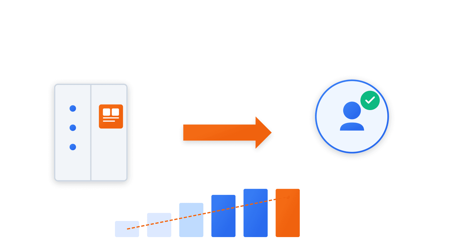
Activation rarely fails because users are confused.
In most products where activation stalls, onboarding completes successfully. Users reach the core interface. Primary actions are visible and usable. Nothing blocks progress.
What stalls is interpretation. Users take actions without forming a clear belief about what changed or why continuing matters. They can move forward, but they cannot describe what they are moving toward.
At that point, additional UX work stops helping. Reducing steps or refining layouts improves usability but leaves the core problem untouched. The product is easy to use, yet difficult to commit to.
The missing element is not guidance or instruction. It is a legible shift. Product storytelling makes that shift visible by naming progress, aligning early actions to a clear outcome, and connecting sessions into a coherent sense of change.
This is how activation increases without more UX work.
Activation Friction Often Has Nothing to Do With UX
The interface looks complete. You move through it without friction.
You finish the first steps and slow down. Nothing is broken. Nothing is pulling you forward.
The screen offers choices without priority. You scan instead of acting.
Progress exists, but its meaning is unclear. The product functions, but its relevance is still unproven.
Momentum begins with a small recognition. A result that mirrors your own situation. A problem named the way you would name it.
After that, the next step requires no prompting.
What Product Storytelling Actually Means Inside a SaaS Product
Storytelling inside a product shows up as framing. What the product chooses to name. What it places first. What it implies before asking for action.
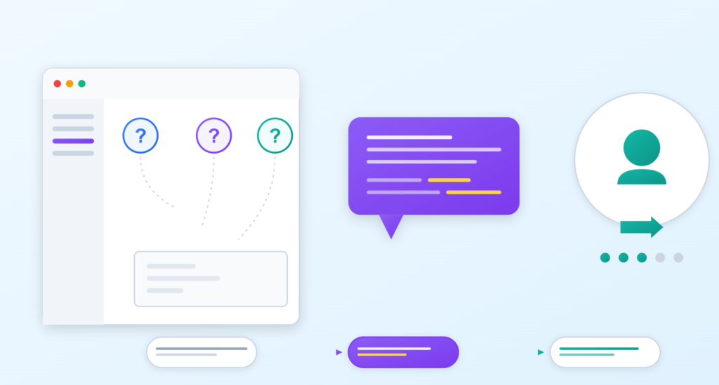
Before a user clicks anything, language has already set expectations. A label suggests effort or ease. A description hints at outcome or busywork. Users decide what this product is for before they decide what to do with it.
Feature explanations describe capability. They list what exists.
Signals of change suggest what will be different after use.
One tells the user how the product works.
The other helps the user imagine themselves working differently.
Inside a SaaS product, storytelling is not a narrative layer added later. It is the quiet guidance that shapes belief before behavior.
The Unspoken Questions Users Carry Into the Product
- Why should I start here and not somewhere else?
- What changes if I keep going instead of stopping?
- Whether this was built with someone like me in mind.
These questions are rarely asked out loud. They sit beneath the first clicks. They shape how much patience a user brings to the screen.
When the product answers them quietly, progress feels natural. When it does not, every step feels optional.
Why Additional UX Work Often Stops Moving Activation Metrics
Early UX work removes obvious friction. Later changes mostly smooth what is already usable. Each refinement makes interaction slightly easier, but the effect on behavior shrinks.
Most SaaS products rely on patterns users already know. Tables, filters, forms, and dashboards do not need explanation. Improving their clarity rarely changes whether a user continues, because understanding was never the issue.
What remains is a gap between usability clarity and motivation clarity. Users know how to proceed, but not what improves if they do. When that gap is present, reducing friction does not increase activation. It only makes stopping easier.
Storytelling’s Role in Creating Early Momentum
Early momentum comes from feeling progress, not from completing tasks. Users continue when something changes in a way they can notice, even if that change is small.
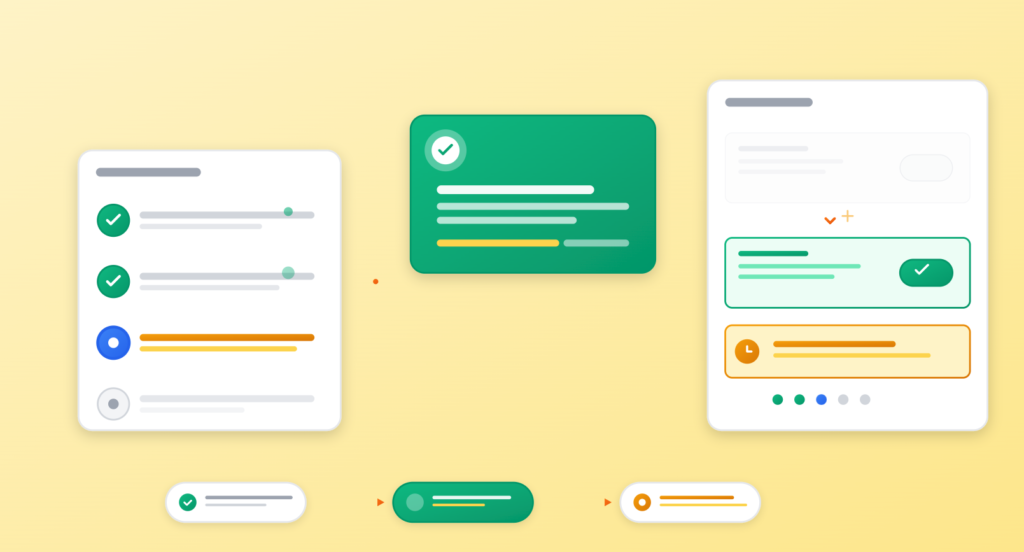
Language plays a central role in making that progress visible. It draws attention to what just improved, what is now possible, and what was not true a moment ago. Without that cue, progress happens but goes unrecognized.
Actions that lead somewhere visible create momentum. When steps are framed as moving toward a clear outcome, users understand why the action matters now, not later. This turns forward motion into something felt, not just recorded.
Where Product Storytelling Shows Up Without New UX Work
Storytelling shows up first in headlines. A dashboard title or setup screen header can signal what matters now and what outcome the user is moving toward, before any interaction happens.
Empty states are another leverage point. When they point to a next step or a likely use case, they create direction. When they only describe absence, they stall momentum.
Success messages reinforce progress. They mark what just changed and why it matters, instead of simply confirming completion.
Navigation and labels shape expectations across the product. When they imply sequence and intent, users understand how pieces connect and what comes next, without being told explicitly.
UX-Led Activation vs Story-Led Activation
This section is comparative. It should clarify the difference in intent, not argue for one side emotionally. A table is the right format.
Two Approaches to Activation
| Area | UX-Led Focus | Story-Led Focus |
|---|---|---|
| Onboarding | Success states | Clarify progress |
| Copy | Instructional | Directional |
| Success states | Functional | Reinforcing |
| Success states | Completion | Recognition |
What this table needs to make clear is simple:
UX-led activation optimizes the path. Story-led activation shapes the meaning of movement along that path.
Signals That Storytelling Is the Missing Activation Lever
Users complete onboarding, then disappear. The initial session ends cleanly, but there is no reason compelling enough to come back.
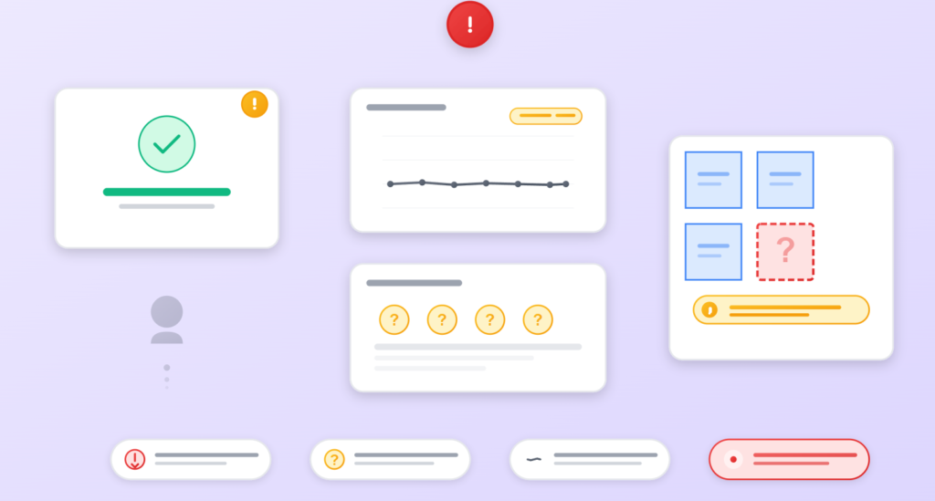
Demos perform well, yet self-serve usage drops quickly. The product makes sense when explained, but fails to explain itself once the user is alone.
Support questions cluster around next steps. Not how something works, but what should be done after it works.
Activation metrics flatten even as UX improves. Friction goes down. Behavior does not change. The product is usable, but its direction remains unclear.
A Practical Way to Introduce Storytelling Without a Rewrite
Start with the copy that already exists. Most products explain steps well enough. The audit is about finding where language describes actions but never signals why they matter.
Next, define the before and after state the product enables. Not the full transformation. The first visible shift a user should notice early. That shift becomes the reference point for all early messaging.
Key screens should align to that same change. Setup, first-use, and confirmation screens should all point to the same outcome, not introduce new ones. Consistency builds belief faster than novelty.
Early sessions should feel connected. What a user sees on day one should prepare them for what they see next time. Continuity replaces reminders. Progress feels ongoing rather than reset.
A Simple Product Story Audit
-
Entry expectation: What the product implies will happen when the user starts. The promise made by headlines, labels, and first screens.
-
First meaningful action: The first action that produces a result the user can recognize as useful. Not setup. Not configuration.
-
Visible progress cue: A clear signal that something has changed because of that action. The product should surface this change immediately.
-
Reinforced outcome: Language or feedback that connects the change back to the original expectation. This confirms that the product is doing what it suggested it would do.
Activation Improves When Users Can Name the Change
Activation improves when progress is easy to describe. Users continue when they can explain, in simple terms, what is better now than before.
Storytelling helps turn usage into belief. It gives language to the change that just occurred, so the user does not have to infer it on their own. When progress is named, it feels real.
UX supports action by removing friction. Story supports commitment by making the outcome clear. When both work together, users do not just move forward. They choose to keep going.
Keep reading